ZPA Infrastructure Dashboard
A private application is only as available as the chain that delivers it: application segment, server group, connector group, connector. The Zscaler console holds each link on a different page. This dashboard draws the chain, colours it by health, and lets you see where it is one failure away from an outage.
It is for whoever gets the call when an internal application stops answering.
When to use it
- Before the outage: find the application segments served by a single connector group, or by a group with one surviving connector.
- During the outage: start from the application, follow the path down to the connector that is down.
- Capacity and expansion planning: see where your connector footprint actually is, and where it is not.
- Fleet maintenance: find connectors on an end-of-life OS or drifting from the expected version, before they become the reason something failed.
Where to find it in the UI
Hover the ZHERO icon, click Dashboards, and select the ZPA Infrastructure tab. It carries a BETA badge. The tab appears on ZPA-capable tenants.
Three sub-tabs:
| Sub-tab | What it shows |
|---|---|
| Map | Connector groups on a world map, coloured by health |
| Topology | The delivery chain as a flow diagram or as a mesh |
| Fleet status | Counts, zombies, version drift, deprecated OS, redundancy |
All three read the same health index, so a group that is amber on the map is amber everywhere.
Map
One pin per connector group, never per individual connector, coloured by the group’s health.
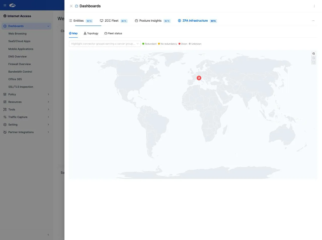
- Zoom, fit and drag to move around. Groups that share a screen cell at world scale collapse into a cluster marker and separate as you zoom in, so co-located data centres stay distinguishable.
- A group with no location (neither its own geography nor any locatable member connector) is listed in a side panel rather than dropped on the map at a guessed position.
- The server-group selector puts a halo around the connector groups that serve the selected server group: this is how you see the geographic spread behind one application path.
- Hover a pin for the group’s card, click for its full drawer.
Read the map for concentration risk. A footprint clustered in one region is a resilience question long before it is a latency one.
Topology
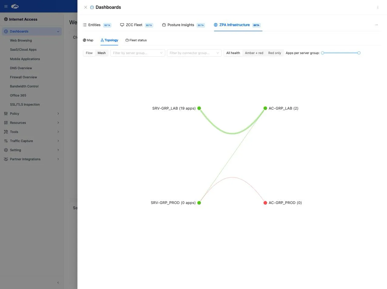
The same model rendered two ways, switched with the Flow / Mesh toggle.
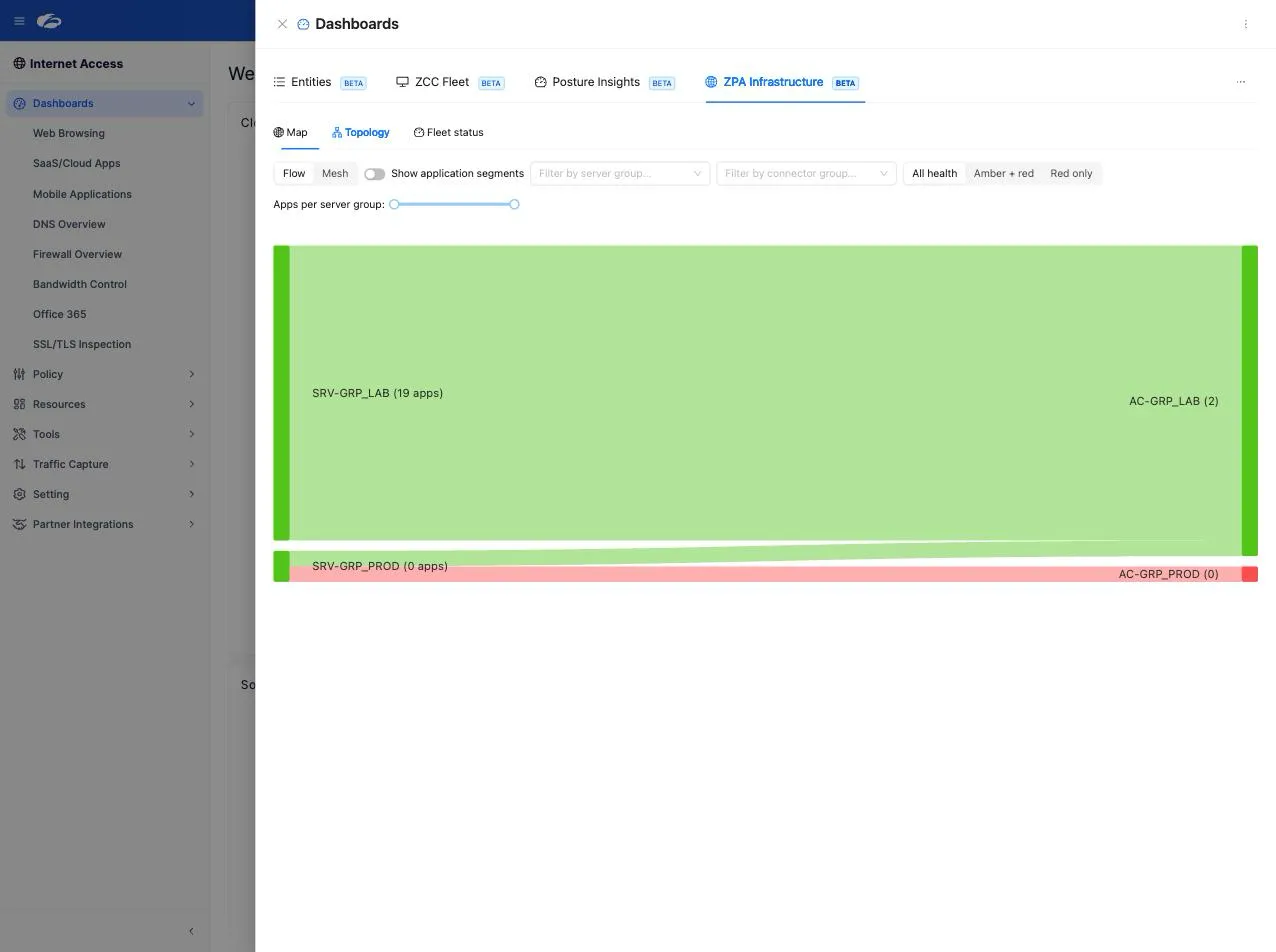
- Flow is a Sankey diagram. By default it flows server group to connector group, with link thickness proportional to the number of application segments the server group carries. A toggle adds a left column for application segments. Use it to see weight: which paths carry most of your estate.
- Mesh places server groups and connector groups on opposite arcs of a circle and bundles the edges between them. Use it when the relationship is dense and the Sankey becomes a wall.
Colour and hover
Connector group nodes carry their own health colour. Server groups and application segments take the best health among what they depend on downstream, because a segment with one healthy path is still up. A link takes the colour of its target.
Hovering a node highlights the whole flow through it, upstream and downstream, not just its immediate neighbours. Hover a connector group and every application segment that reaches it lights up: that is your blast radius, drawn.
Filters
| Filter | Behaviour |
|---|---|
| Server group and connector group selectors | Combine as a union: a server group is kept if it is selected directly, or if it serves a selected connector group |
| Health level (All, Amber and red, Red only) | Narrows server groups, and connector groups follow. It deliberately does not hide application segments, so the segments feeding a failing path stay visible |
| Applications per server group | A range slider, shown when at least one server group carries application segments |
| Funnel glyph on a node | Hover a server or connector group node and click the funnel to add that node to the matching filter |
Clicking any node opens its entity drawer, with the usual analysis, collaboration and audit tabs.
Fleet status
The connector fleet in numbers:
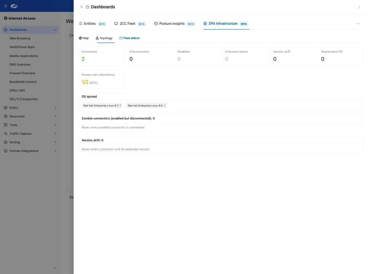
- Status counts across the fleet
- Zombies: enabled but disconnected from the control channel, longest-down first
- Version drift: connectors on a version other than the one the control plane expects, or rolled back to an older one
- Deprecated OS: connectors on an end-of-life OS line, which receive no security patches
- OS spread across the fleet
- Group redundancy: how many connector groups have no redundancy at all
The same signals are also raised as findings by the Analysis Engine, so they reach the posture score and can be turned into to-dos. Down durations are recomputed as you look at them, not frozen at the moment the data was fetched.
What to watch
| Pattern | Why it matters |
|---|---|
| A connector group with exactly one connected connector | A single point of failure that looks fine in a status list |
| An application segment whose path resolves to one connector group | One data-centre event takes the application down, however many connectors that group holds |
| A zombie that has been down for days | Nothing alerted, because the group still answers |
| Version drift concentrated in one region | Usually a stalled upgrade, not a coincidence |
| Grey pins on the map | Health could not be determined. See the note below before treating it as fine |
Limits and notes
- The tab is labelled BETA.
- If the connector list cannot be fetched, the dashboard does not error. Pins degrade to neutral grey (unknown health) rather than red, and the difference between “endpoint unavailable” and “zero connectors” is preserved. Grey is not a pass.
- Positions come from Zscaler, from the connector group’s own geography or the centroid of its member connectors. Groups with neither are listed separately rather than placed arbitrarily.
- This is a read surface. Connector health is fixed in the Zscaler console and on the connector hosts themselves; ZHERO shows you where to go.
- The Map and the Topology are drawn from the same fetched data, so switching between sub-tabs does not re-query the tenant.
FAQ
Why is a pin one colour on the map and its application segment another in the topology? Connector groups show their own health. Segments and server groups show the best health among what they depend on, since one healthy path is enough to serve traffic. A green segment above an amber group means it has another way through.
What counts as a zombie connector? One that is enabled but not connected to the control channel. It is worse than a disabled connector, because the configuration still expects it to serve traffic.
The health filter is set to Red only, and I can still see green application segments. That is deliberate. The filter narrows server and connector groups, never segments: hiding the applications that depend on a failing path would defeat the purpose of the view.
Can I fix a connector from here? No. Click through to the entity for the detail, then act in the Zscaler console or on the host. The useful output of this dashboard is knowing exactly which one.
Does this work on an Experience Center tenant? Yes, wherever the tenant carries the ZPA plane.
Related pages
- ZPA Diagnostics Engine: who and what is actually traversing these paths
- Analysis Templates catalog: the ZPA resilience templates behind these signals
- Security Posture Dashboard: where the ZPA findings become a score
- ZPA Domain Management: bulk changes to the segments you find here
Next steps
- Open Fleet status first and read the redundancy number
- Switch to Topology, filter to amber and red, and note which applications sit above them
- Open the Map and look at your footprint against where your users actually are
- Turn the two worst findings into to-dos with owners